Read the Surface: How Smart Creatives Choose Paper Finishes Like a Pro
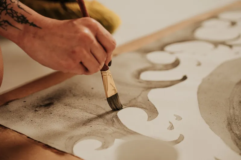
There's a moment most artists know well. You sit down with a new sheet of paper, lay down the first mark — and something is just off. The ink beads. The pencil skates. The paint dries too fast or too slow. The work that felt so clear in your head suddenly feels like it's fighting you.
Nine times out of ten, the problem isn't your technique. It's your surface.
Paper finish — whether a sheet is matte, gloss, silk, vellum, or somewhere in between — is one of the most underestimated variables in any creative practice. Most people pick a finish based on what looks nice in the package, or what they're used to grabbing. But the artists who consistently get the results they're after? They've learned to think about finish the way a chef thinks about cookware. The right surface for the job isn't just a preference. It's a strategy.
What "Finish" Actually Means (and Why It Matters More Than You Think)
At its most basic, a paper's finish describes the texture and coating of its surface — how much light it reflects, how much ink it absorbs, how much friction your tools encounter when they make contact. Manufacturers achieve different finishes through calendering (pressing paper between rollers), coating with clay or other materials, or leaving the surface largely unprocessed.
Matte paper has a low-sheen, slightly toothy surface that absorbs ink and paint readily. Gloss paper has a smooth, reflective coating that makes colors pop but can resist absorption. Silk (sometimes called satin) lands in the middle — less reflective than gloss, smoother than matte. Vellum, in the paper world, typically refers to a translucent, slightly waxy surface that behaves differently from all of them.
Each finish creates a different physical relationship between your tools and the page. And once you start thinking about it that way, you can't really un-think it.
The Illustrator Who Swears by Matte — But Not for the Reason You'd Expect
Jamie, a freelance illustrator based in Portland, Oregon, spent years defaulting to smooth Bristol because it was what her college professors used. "I thought smooth was just... correct," she says. "Like there was a right answer and matte surfaces were for people who didn't know better."
Then she started working with brush pens on a cold-press matte cardstock for a personal project and noticed something unexpected: her linework got looser. Better, actually. "The slight tooth slowed my hand down just enough that I stopped rushing," she explains. "With a super-slick surface, I'd overwork everything. The matte finish kind of forced me to commit."
Now Jamie keeps multiple finishes on hand and chooses based on the phase of a project. Rough sketching and inking? Matte. Final color work that's going to be scanned? She'll sometimes switch to a silk finish to get more even pigment distribution with her markers.
Gloss Isn't Just for Photos
A lot of crafters associate gloss paper with inkjet photo printing and not much else. But gloss-coated cardstock has a devoted following among mixed-media artists who work with alcohol inks — and the reason is pure chemistry.
Alcohol inks don't absorb into gloss surfaces the way they do into porous ones. Instead, they sit on top and flow freely, which is exactly what makes those swirling, luminous effects possible. Try the same technique on matte paper and the ink gets absorbed before it has a chance to move.
"Gloss is the whole game with alcohol inks," says Marcus, a maker in Atlanta who sells abstract panels on Etsy. "The finish isn't decorative — it's functional. Without it, the technique doesn't work."
Marcus also points out that gloss finish affects how you layer. Because the surface doesn't absorb, each layer stays more distinct. "You get this incredible depth when you build up layers on gloss. On matte, everything kind of blends together into the paper. Sometimes that's what you want. But for what I do, I need those layers to stay separate."
Vellum: The Finish That Rewards Patience
Vellum paper occupies a weird, wonderful niche. It's translucent, which immediately opens up layering possibilities that opaque papers can't touch. But it's also finicky — not every medium plays nicely with its surface, and humidity can cause it to buckle if you're not careful.
Sophia, a paper artist in Chicago who specializes in botanical illustration, uses vellum almost exclusively for detail work that she layers over opaque backgrounds. "The translucency lets me build up complexity without committing," she says. "I can move a vellum layer around, adjust the composition, before anything is permanent."
Her advice for working with vellum: go slow, use pigment-based inks rather than dye-based ones (they sit on the surface better), and never rush the drying time. "Vellum punishes impatience," she laughs. "But if you work with it instead of against it, the results are unlike anything else."
Silk Finish: The Workhorse Nobody Talks About Enough
If matte is the artist's sketchbook surface and gloss is the showstopper, silk finish is the reliable workhorse that quietly does the most. It's smooth enough to give you clean, even color with markers and inkjet printing, but it has just enough texture to accept pencil and light pen work without skating.
For crafters who do a lot of card-making, scrapbooking, or paper crafting that involves both printing and hand-finishing, silk-coated cardstock is often the sweet spot. You get the clean print quality of a coated surface plus the ability to write on it with a ballpoint or add hand-lettering without the ink balling up the way it sometimes does on gloss.
"I print my backgrounds on silk cardstock and then hand-letter on top," says Dana, a stationery designer in Nashville. "It's the only finish that lets me do both without switching papers. For my workflow, that's everything."
Building Your Finish Vocabulary
The best way to develop an instinct for finish selection is to run your own tests — deliberately, not accidentally. Grab a few sheets of the same weight in different finishes and work through the same technique on each one. Notice where your tools grip and where they glide. Notice how the color looks wet versus dry. Notice how the surface responds to layering.
Keep notes. Seriously. A simple notebook where you tape small swatches and jot down what worked and what didn't will save you more frustration than any buying guide ever could.
Once you've done this a few times, you'll start to develop what some makers call a "surface sense" — an almost automatic read of whether a given finish is going to support or fight what you're trying to do. It's the same skill a woodworker develops with grain direction or a baker develops with dough texture. You learn it through your hands, not your eyes.
And when you finally sit down with the right finish for your process? You'll know it in the first mark. Everything just moves the way it's supposed to.
That's not magic. That's craft.