Hands-On Truth: Why the Way Paper Feels Is the Creative Signal You've Been Ignoring
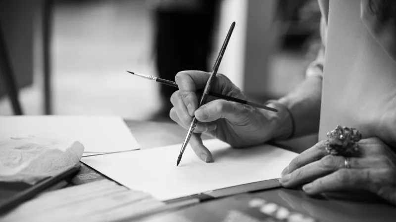
Here's something that happens to almost every crafter at some point: you order a paper that looks absolutely perfect in photos. The color is right, the weight seems ideal, the description checks every box. Then it arrives, you pick it up — and something is just off. You can't always explain it immediately. But your hands know.
That instinct isn't mystical. It's information. And a surprising number of working artists, bookbinders, and letterpress printers say that learning to actually listen to it was one of the most significant shifts in their creative practice.
What We Mean When We Talk About Texture
In paper terms, texture is a whole conversation happening beneath the surface of what you can see. There's tooth — the microscopic roughness that grabs at pencil graphite or pastel and holds it in place. There's smoothness, which affects how ink flows and whether brush strokes glide or catch. And then there's something harder to name: surface resistance, the way a sheet pushes back (or doesn't) when you work on it.
These qualities don't always match what a paper looks like. A sheet with a subtle sheen might feel surprisingly toothy under your fingers. A matte, unassuming cardstock might be slicker than glass. Visual samples — even high-quality ones — compress all of that nuance into two dimensions and strip out the tactile data entirely.
"I spent years buying paper based on how it photographed," says Dana Keller, a mixed-media artist based in Portland, Oregon. "I'd see something in a flat lay on Instagram and think, yes, that's what I need. Half the time I was wrong. The paper fought me the whole way through a project and I couldn't figure out why. It took me embarrassingly long to realize I needed to actually touch things before committing."
The Letterpress Lesson
In the letterpress world, paper feel isn't a preference — it's a technical requirement. The impression, that gorgeous debossed quality that makes letterpress printing so distinctive, depends entirely on how a sheet compresses under pressure. Too hard and the impression is shallow. Too soft and the type sinks in unevenly. The paper has to have the right amount of give.
Marco Tran runs a small letterpress studio out of Austin, Texas, and he's been printing for over a decade. He describes his paper selection process as almost meditative. "I'll fold a corner back and forth a few times to feel the fiber. I'll run my thumbnail across the surface. I'll hold it up to the light, sure, but honestly that's almost secondary. My hands tell me more in thirty seconds than my eyes do in five minutes."
He's particularly attentive to what he calls the "snap" of a sheet — the way it resists bending before it finally gives. "A paper with good snap has a kind of integrity to it. It holds its shape under the press. Papers that feel floppy before you even start tend to give you trouble."
Bookbinders and the Long Game
Bookbinders have their own deeply tactile relationship with paper, and for them, the stakes are longevity. A book is meant to be handled hundreds of times. The paper inside it needs to withstand repeated flexing without cracking, tearing, or becoming brittle over time.
Sophie Reinholt, a hand bookbinder in Minneapolis who teaches workshops out of her studio, says she tests paper by feel in ways her students initially find strange. She'll rub a corner between her fingers to assess the surface coating. She'll tear a small strip to feel the grain direction and the fiber length. She'll even hold a sheet against her cheek — an old papermaker's trick — to sense the moisture content.
"People look at me like I'm a little unhinged," she laughs. "But every one of those tests tells me something. The cheek test especially — paper that feels slightly cool and smooth against your skin tends to have a good moisture balance. Paper that feels almost chalky or overly dry is going to be brittle and more prone to cracking at the folds."
Sophie says her students go through a real shift during her workshops. "They come in very visually oriented, which makes sense — we live in a visual culture. By the end of the first day, they're touching everything. They start to realize that the paper is communicating with them and they just haven't been listening."
Building Your Own Tactile Intuition
The good news is that this kind of sensitivity isn't some innate talent reserved for people who've been working with paper for decades. It's a skill, and you can develop it deliberately. Here are a few exercises worth trying at home:
The Blind Touch Test. Pull out a few different papers from your stash — varying weights, finishes, and fiber types — and handle them without looking at the labels. Just feel. Notice what's different. Does one feel heavier even if it's technically the same weight? Does one feel slicker than it looks? Write down your impressions before you check what you're actually holding.
The Drag Test. Run a pencil lightly across several different surfaces and pay attention to the resistance. Paper with more tooth will grab the pencil and create a slightly rougher line. Smoother sheets will let the pencil glide but won't hold as much pigment. Neither is better — they're just different tools for different intentions.
The Fold and Score Test. Fold a small strip of each paper in half and run your fingernail along the crease. Some papers fold cleanly; others crack or show stress lines. This tells you a lot about how the sheet will behave if you're doing origami, bookbinding, or any project that involves folding.
The Wet Media Test. If you work with watercolor, ink, or any wet medium, dampen a small corner of several different sheets and let it dry. Feel the difference before and after. Some papers buckle dramatically; others stay relatively flat. Some get rougher when wet; others smooth out. Your hands will remember these differences faster than your brain will.
When Feel and Function Finally Align
Ask any of the artists we spoke with about the moment their tactile instincts and their creative practice finally clicked into place, and you get a version of the same story: a project that suddenly felt effortless. Not because the work got easier, but because the paper stopped being an obstacle and started being a collaborator.
Dana Keller describes finishing a large collage series last year and realizing she hadn't fought the materials once. "Every paper I used felt right from the moment I picked it up. I didn't have to force anything. It sounds simple, but it was honestly kind of emotional. Like, oh — this is what it's supposed to feel like."
That's the real payoff of developing your tactile intuition. It's not just about avoiding bad purchases, though it absolutely helps with that. It's about shortening the distance between your intentions and your results. When you know what a paper is going to do before you even start, you can make smarter decisions, take more interesting risks, and spend less time fighting your own materials.
Your eyes are great at a lot of things. But when it comes to paper, your hands might just be the smarter sense.