Why the Paper Beneath Your Words Changes Everything About How They Land
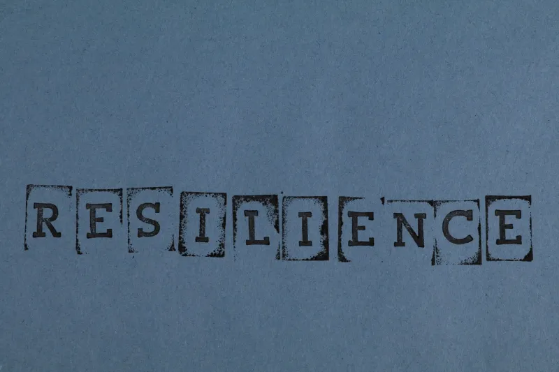
You spent three hours choosing the right typeface. You tested point sizes, adjusted leading, tweaked the tracking until it felt just right on screen. And then you sent it to print on whatever paper happened to be loaded in the tray—and something got lost.
It's a scenario that plays out constantly in print shops, home studios, and letterpress workshops across the country. Designers obsess over type. They study Baskerville versus Garamond, debate serif versus sans, and argue passionately about widows and orphans. But the surface the type actually lands on? That part often gets treated like an afterthought.
It shouldn't be. The paper you choose is a silent co-author of every typographic decision you make.
What Actually Happens When Ink Meets Paper
Let's get a little nerdy for a second, because the science here is genuinely fascinating.
When ink hits a smooth, coated paper, it sits on top of the surface. The coating—usually clay-based—seals off the fibers and creates a tight, controlled landing zone for each droplet. The result is sharp edges, crisp serifs, and high contrast between the printed area and the white space around it.
On an uncoated or textured paper, the story changes completely. The ink sinks into the fibers, spreading slightly as it's absorbed. That spread is called dot gain, and it's not necessarily bad—but it is different. Fine hairlines in a delicate typeface can fill in or soften. A thin serif that looks razor-sharp on a coated stock might look slightly fuzzy, or even warm and organic, on a toothy cotton paper.
Neither result is wrong. But they're not the same. And if you designed your piece assuming one and printed it on the other, you might end up with something that just doesn't feel right—even if you can't immediately explain why.
The Smooth End of the Spectrum
Coated papers—glossy, matte, and satin finishes—are the workhorses of commercial print for a reason. High dot gain control means even very small type stays legible. Very fine typefaces hold their structure. Photo-realistic images pop. If you're printing a magazine spread, a product catalog, or anything where precision and contrast are priorities, a coated sheet usually makes sense.
But there's a tradeoff. Coated papers can feel cold. Clinical, even. Type printed on a high-gloss stock tends to feel efficient and authoritative rather than warm or personal. That's perfect for a tech company's annual report. It's less perfect for a handmade wedding invitation or a poetry chapbook where intimacy is the whole point.
Satin and matte coatings land somewhere in the middle—still smooth enough to hold fine detail, but with less sheen and slightly more warmth. A lot of designers default to uncoated matte for body text precisely because it mimics the feel of reading a book while still offering decent ink control.
The Texture Side of the Conversation
Here's where things get interesting for anyone working in letterpress, hand-stamping, or fine art printing.
Textured papers—laid papers with their subtle ribbed pattern, linen-finish stocks, rough watercolor papers, or heavy cotton sheets—introduce a physical dimension to type that coated stocks simply can't replicate. When you run your finger across a beautifully letterpressed word on a thick cotton sheet, you're feeling the type as much as reading it. The impression left in the paper becomes part of the message.
But texture demands respect from your type choices. Delicate, high-contrast typefaces with very thin strokes—think certain display faces in the Didone style, with their dramatic thick-thin variation—can struggle on rough surfaces. Those hairline strokes may not hold, leaving the type looking incomplete or damaged rather than refined. Robust, sturdy typefaces with more uniform stroke weights tend to survive texture better. Slab serifs, well-spaced grotesques, and classic old-style faces have been printed on textured papers for centuries for exactly this reason.
If you're working with a letterpress setup or hand-printing onto handmade sheets, it's worth doing test prints with your actual typeface before committing to a full run. What looks beautiful on screen, or even on a smooth proof sheet, can behave very differently once it meets a paper with real personality.
Contrast, Legibility, and the Role of Paper Color
It's not just texture that plays into readability—paper color matters enormously, and it's one of the most overlooked variables in typographic decision-making.
True white papers give you maximum contrast with black ink, which sounds ideal but can actually cause eye strain in long-form reading. There's a reason most books are printed on off-white or cream-toned stocks. That slight warmth reduces contrast just enough to make sustained reading more comfortable, without sacrificing legibility.
Natural or warm-toned papers—think unbleached kraft sheets or warm ivory cotton papers—pair beautifully with warm ink colors and create a cohesive, inviting feel. But they can make cool-toned or very light ink colors disappear. If you're printing a pale gray or a soft blue on a warm ivory sheet, test first. The paper's undertone can either complement or fight your ink choice in ways that are genuinely hard to predict without a physical proof.
Practical Guidance for Choosing Paper for Written Work
So how do you actually make smart decisions here? A few principles that hold up across different project types:
Match the mood of the paper to the mood of the piece. A rough, textured sheet communicates handcraft, warmth, and intentionality. A sleek, smooth stock communicates precision and modernity. Ask yourself what your reader should feel before they read a single word.
Scale your type to your surface. If you're printing on a heavily textured or toothy paper, consider bumping your body text size slightly. Fine detail that reads crisply at 9pt on coated stock might need to be 10 or 11pt to survive a rough surface with the same legibility.
Test your most delicate type elements first. Hairlines, fine serifs, and light-weight typefaces are most vulnerable to dot gain and surface texture. Pull a quick test print on your actual paper before running the full job.
Don't fight the paper. If you've fallen in love with a beautiful, heavily textured handmade sheet, lean into typefaces that work with it—not against it. Let the paper's character inform your type choices rather than trying to impose a delicate design onto a surface that wasn't built for it.
Think about the whole stack. If you're creating a set of printed pieces—cards, envelopes, inserts—consistency of paper surface across the set creates a unified reading experience. Mixing a rough envelope with a super-smooth card can feel disjointed in a way that's subtle but real.
The Paper Is Part of the Design
There's a tendency in digital-native design culture to treat print as just another output format—something you send a file to and collect on the other side. But anyone who's worked with specialty papers for any length of time knows that print is a conversation between your design and your substrate.
The paper isn't passive. It has texture, weight, color, and absorbency—all of which are actively shaping how your reader experiences the words you've put on it. The best typographers and print designers have always known this. They choose paper the way they choose typefaces: with intention, with curiosity, and with a willingness to test and adjust.
Your words deserve a surface that helps them land the way you intended. That starts with understanding what your paper is actually doing—and choosing it accordingly.